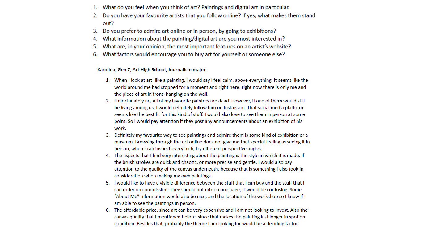
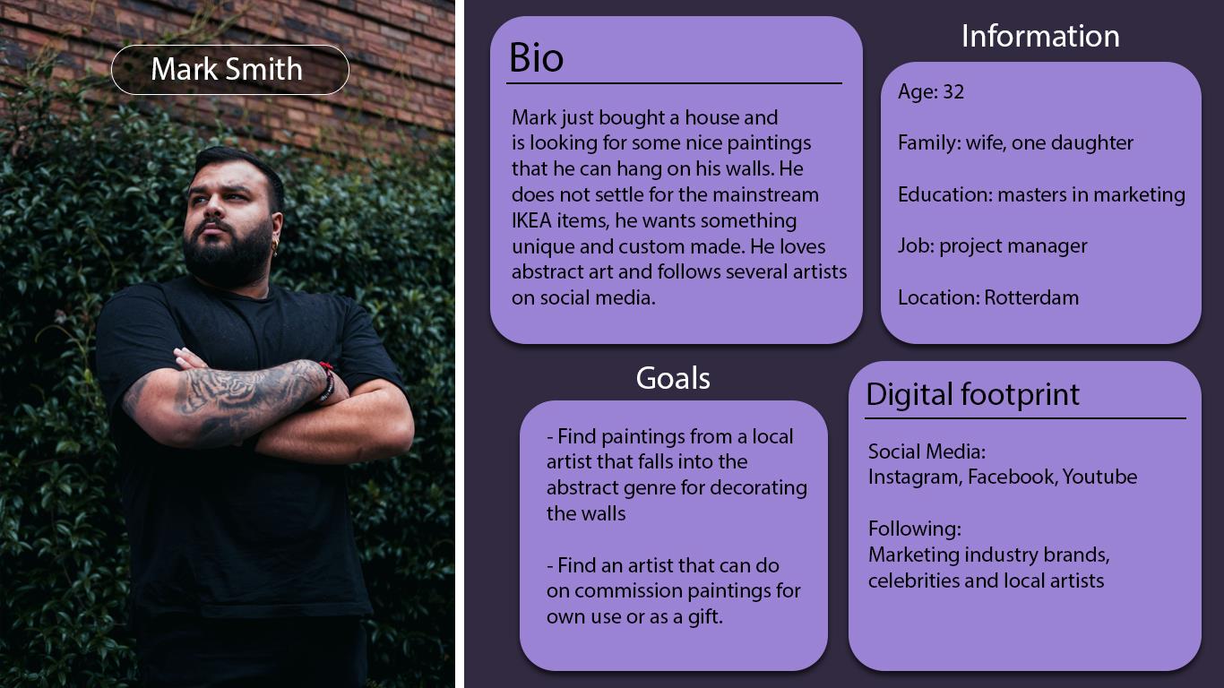
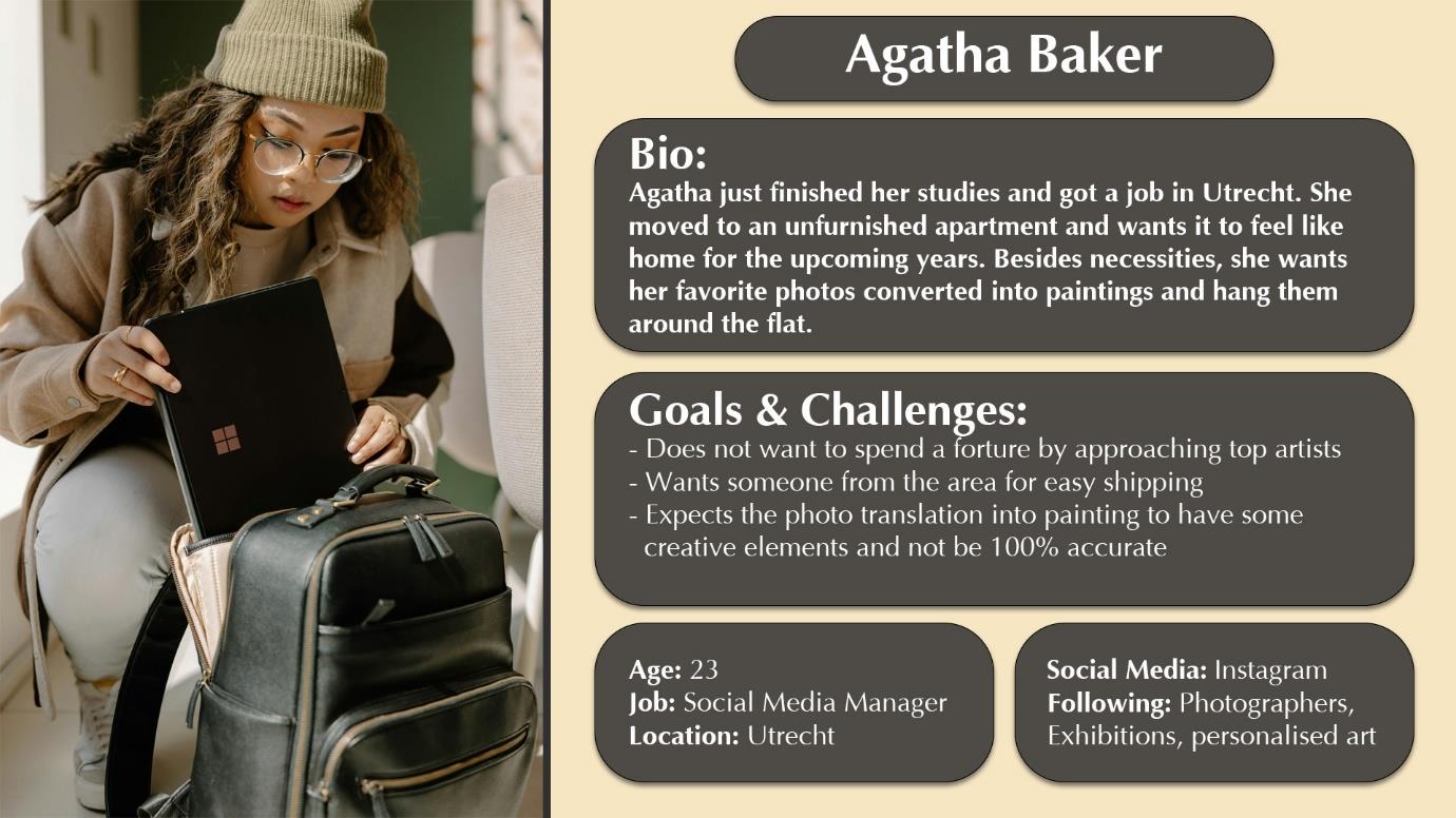
In order to get a better understanding of the target audience, their interaction with social media and essential website features, I have conducted an interview with a Gen Z member who is deeply interested in art. Thanks to the interview and the literature study I was able to create two examples of the ideal personas that would be a perfect fit for our client.
When the Covid-19 pandemic was on its spread, the art market took a big hit due to the imposed travel restrictions and in year 2020 the market’s value lost around $14 billion compared to the previous year. In 2021 the art industry exceeded the expectations, resulting in macro growth and managed to evolve due to ongoing pandemic situation turning the focus on online purchasing (Art Market, 2022). According to data from Statista, in year 2019 (right before the Covid-19 spread) less than a half of the survey responders admitted buying art/collectibles (47%) through an online platform. In the next couple of years, the trust for online purchases increased significantly, reaching 85% in 2021 and keeping it high in 2022 with 78% respondents buying art/collectibles online.
This data gives a clear message, that selling art through an online store or a third-party platform is far more promising and potentially profitable than it was only a couple of years ago. The focus should be on people who are willing to buy our clients paintings online, rather than buyers who need to visit shops or events that allow them to see the art in person.
When it comes to the potential age of the target audience, two demographics are often mentioned in online surveys conducted by couple of organisations. One of the surveys that was posted by Statista split the art buyers into two groups which are people between age 18-39 and 40 or above. The main insight coming from this survey is that customers in the first age group are not only willing to buy art more often than their older counterparts, but also it is more likely for them to make multiple purchases, not only the single ones.
Another source that conducted the international survey on the ongoing trends among the art buyers is provided by the Art Market. According to that research, the art collecting is dominated by the younger generations. Among the respondents, 52% of them were millennials, 35% were born between 1965 and 1980 (Gen X). Baby boomers and Generation Z are 12% each. Even though the Gen Z is only a small percentage of all art buyers, they spend the highest amount of their money on average for the art. This insight highlights the fact that art plays a significant role in the lives of Gen Z individuals, but also shows a promising future that this generation will strongly influence the art market (Art Market, 2022).
Based on this data and information gathered, the best choice for the target audience would be the younger generations that include the millennials as the most active generation on the art market and Gen Z as the ones that are the most promising and are willing to spend the biggest part of their income. What is more, the data analysed from Statista supports that choice by naming the people aged 18-39 to be the most likely to make multiple purchases from the artist.
According to Sprout Social, the trends and data on the social media usage and demographics need an often refresh, since the industry is very dynamic, and research conducted a year prior may not be applicable to the ongoing situation. The most up to date statistics presented in the article, show the most popular social media platforms in certain age range and divided to generations. Since it was determined that the desired target audience for our client are millennials and Gen Z, the research on social media is focused on them, omitting the data on irrelevant generations. When it comes to people aged 18-29, the top three social media platforms that they use place as follows: Snapchat with score of 41%, TikTok with 35% and Instagram with 32%. For people aged 30-39, the situation presents itself so much different. LinkedIn and X platforms getting the highest score of 34%, Snapchat with 33% and very similarly Instagram with 32% (Zote, 2024).
When it comes to being active on social media, Gen Z and millennials take the top spots with the biggest amount of time spent there. More than a third of Gen Z people admit to using social media platforms for more than 2 hours a day, millennials with a quarter of respondents doing the same. The trend goes that the older the generation, the less time they spent on social media daily (Zote, 2024). Instagram placed high on top social media platforms for both generations. According to the statistics Gen Z and millennials make the two-thirds of the Instagram user base, which makes it a perfect choice for our client. These insights support the findings of the survey conducted by our team.
The vital part of content strategy is understanding that timing of posting content online can significantly influence the user engagement. These timeslots can be different among various industries and are dependent on the target audience’s demographics, time zones and work schedules. The main advantage of figuring out the best posting times, so when the audience is the most active, can boost the content visibility and get a nice push from the Instagram’s algorithm. Consistent and well-timed content posting amplifies the user’s engagement and strengthens the content strategy in the long-term process. According to the research conducted by several sources, the best moment to post content on Instagram is the early morning on weekdays when people are prepping for work or have the first brake and seek some entertainment and motivation (Tejeda, 2023).
In order to manage the posting schedule and maintain consistency, it is advised to use social media external tools that can post the content at a preplanned date and time. When applying the strategy of posting during the designated time, it would be recommended to change the account type to business, which allows the user to access analytics provided by Instagram and see how the engagement and view count had been influenced (Tejeda, 2023).
Hashtags are mainly used to help users discover new content that is connected to the specific theme that they want to see. Combine specific hashtags and expand your reach to a larger and more relevant audience that are not yet your followers. There are some tips that are essential for using the hashtags in a right way. The first one would be placing them in the right location within the post. Both the caption and the comment section are recommended and work similarly the same way. The next one, avoid the situation when your post gets lost in a large amount of similar content. Combine the popular hashtags together with the niche-oriented ones that have a lower number of content connected to it. What is more, it is good to be specific about your work. By using tags, the artist can describe the topic, style, technique and materials used during the creation process. Finally, it is helpful to keep a list of most used hashtags to quickly copy-paste it into posts. However, be aware to vary the hashtags that go into more specific aspects in order to better differentiate the work (Scott, 2022).
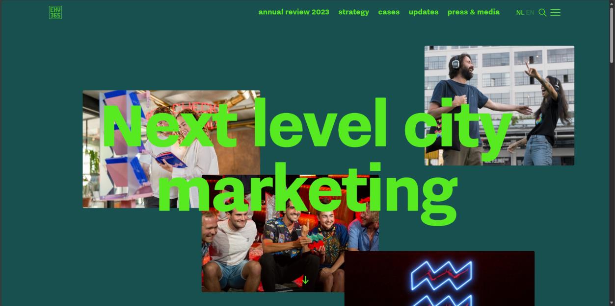
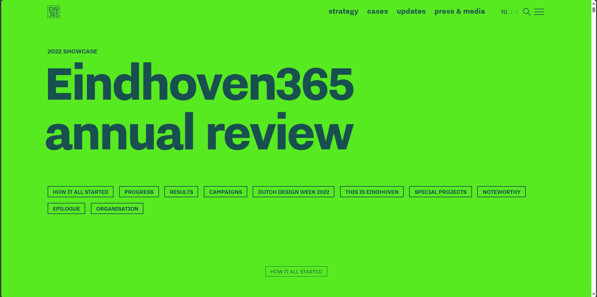
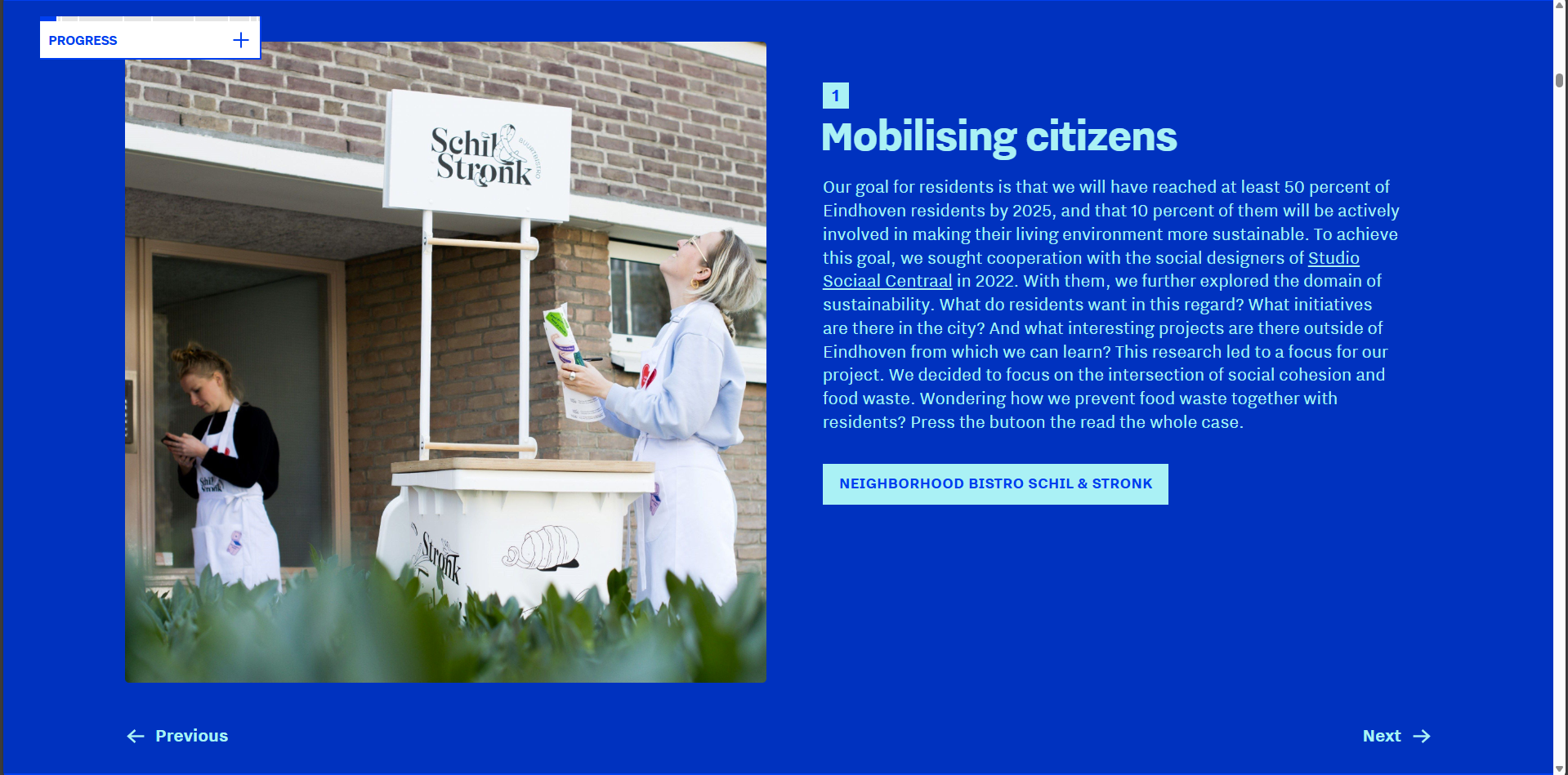
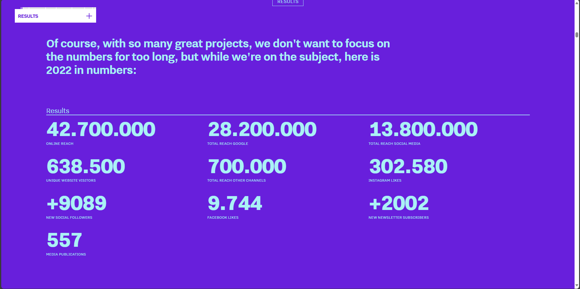
For the “Explore Breda” project it was necessary to conduct research on the competitors and how they plan their strategy on advertising the city of interest. Each team member volunteered to acquire information on possible marketing ideas based on the city of their choice. In my case it was the city of Eindhoven and the company behind its promotion which is the team of Eindhoven365. My main source of information was the annual report of the 2023 campaign and the results it brought at the end of the year in numbers of visitors and user activity.
The research gave me couple of ideas that I decided to implement into the project and explored further. These ideas were: the guidebook created by its users, social media posts about the residents and their story.
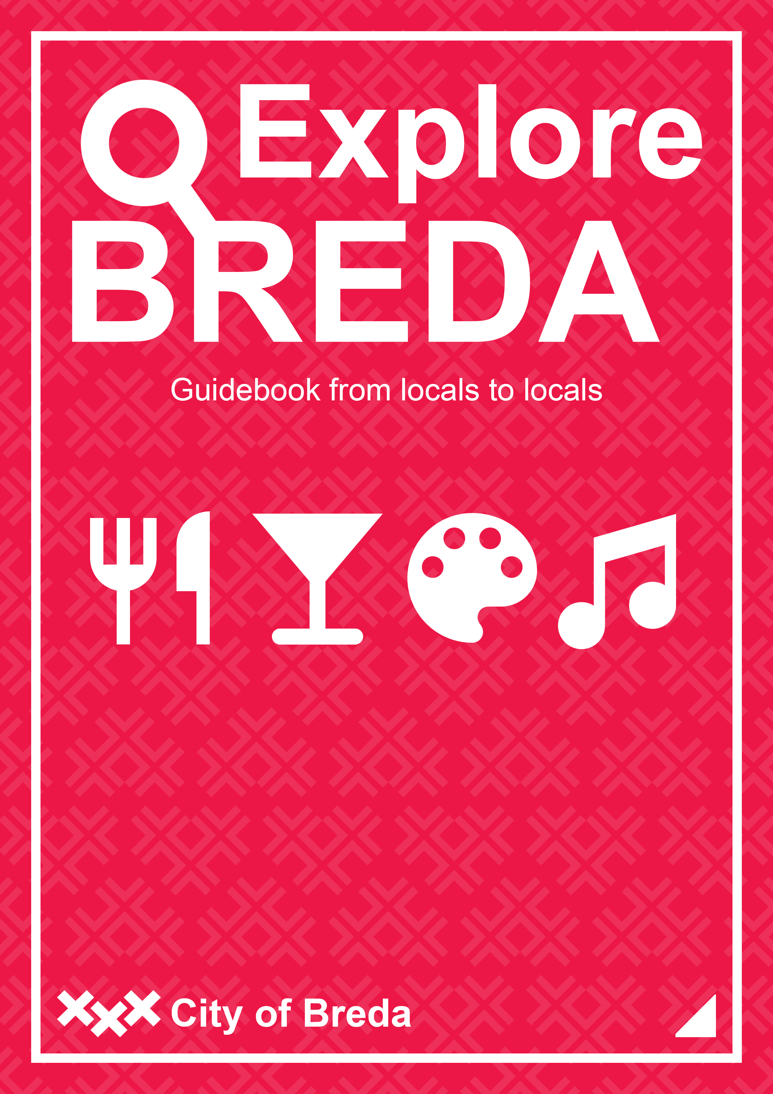
By using the DOT framework, I found the best way to test the variants of my design. By asking teachers and fellow students which cover layout and visuals they preferred, I was able to find the best combination and colors for the final product.

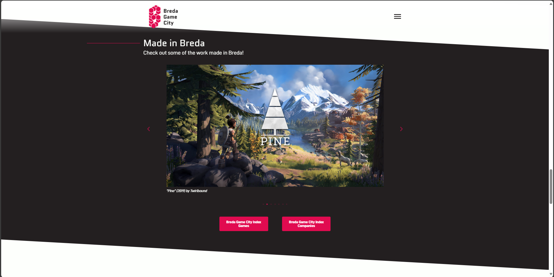
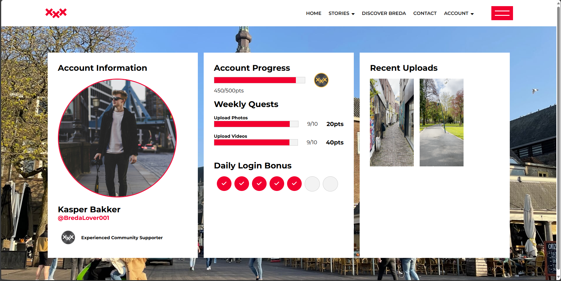
As heard from the client during the presentation on the Media Campaign final deliverables, the Breda is aspiring to become the Netherlands capital of gaming, since some already appreciated video games were developed in Breda. It gave the team an idea for a reward program for the website ambassadors, where the account ranks are based on competitive video games ranking system. In order to proceed with the idea, I conducted a literature study research that validated our client initial statement. I explored the BredaGameCity.nl website that provided me with useful insights that allowed us to implement our reward program.

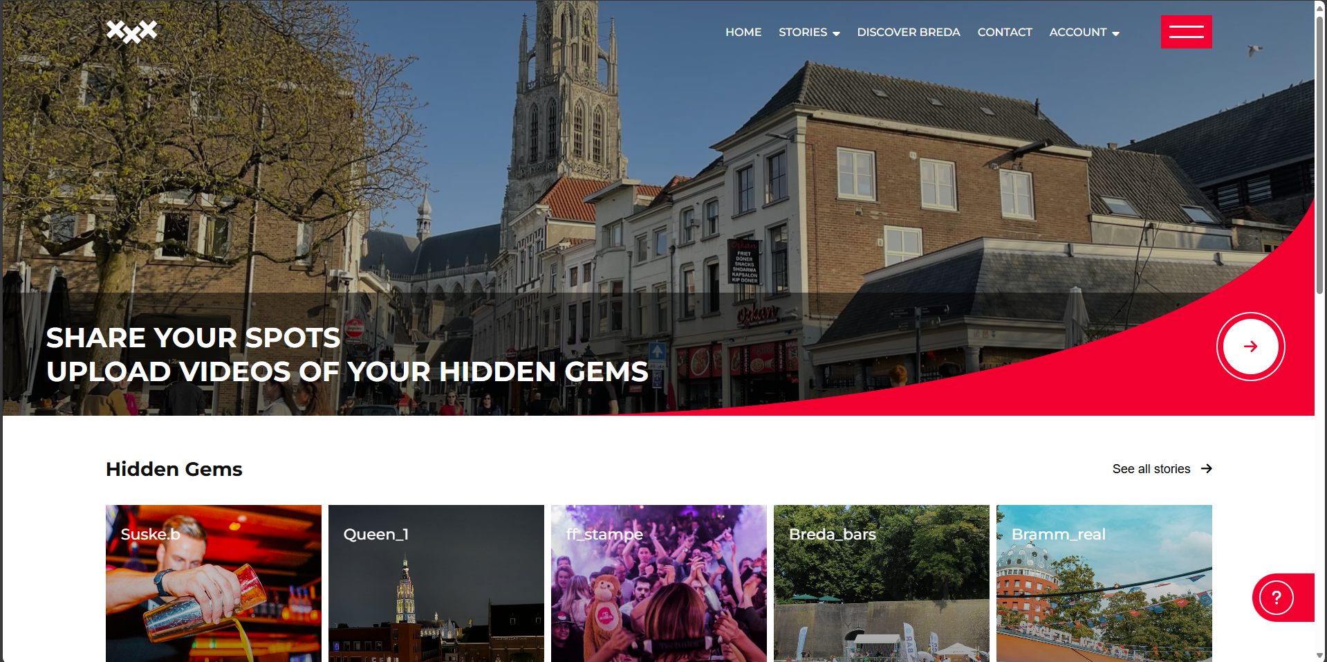
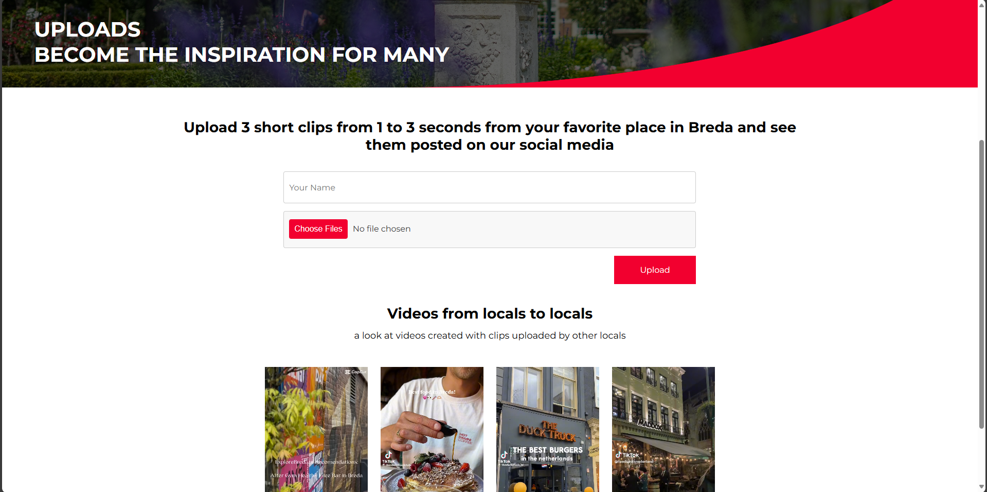
In order to know if the navigation on our website is straightforward and intuitive, we performed a user test on a few of our colleagues and teachers. I wrote a short task description that required the user to go through a couple of steps. Those steps included creating an account, accessing the account's dashboard, entering the uploads subpage and uploading the clips. This test proved very useful as we managed to notice some design flaws, that confused the navigation process and required some adjustments to become more user friendly.
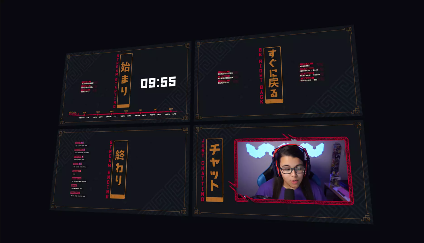
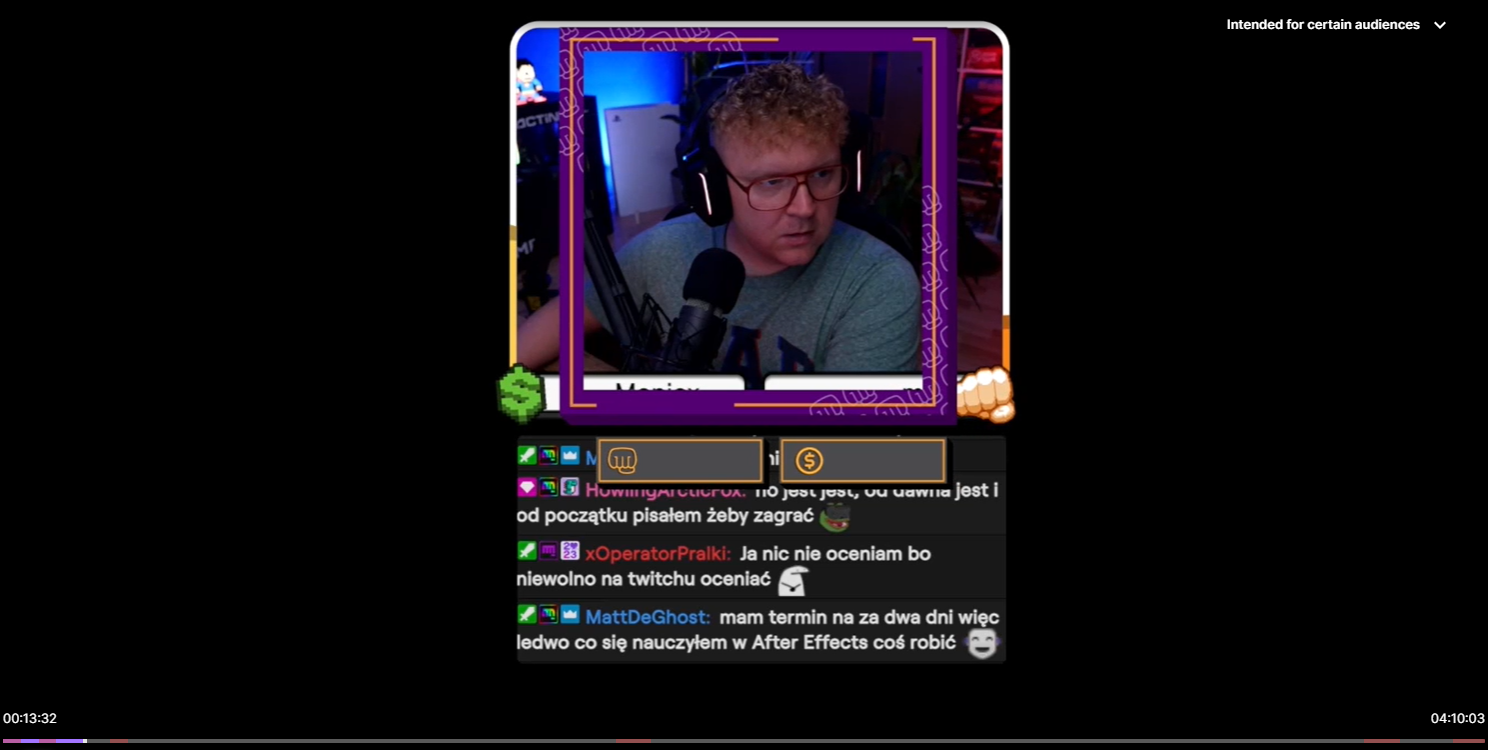
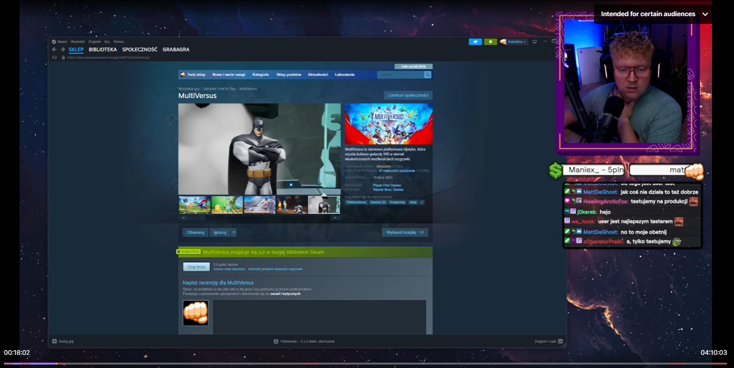
In order to know what exact elements I need to do for my client, I conducted a research on already available streamer packs sold online and checked what elements were the most essential in the majirity of them. The elements that were highlighted the most in the offers were the dynamic scenes, transitions, camera frame, activity feed widgets and information panels.

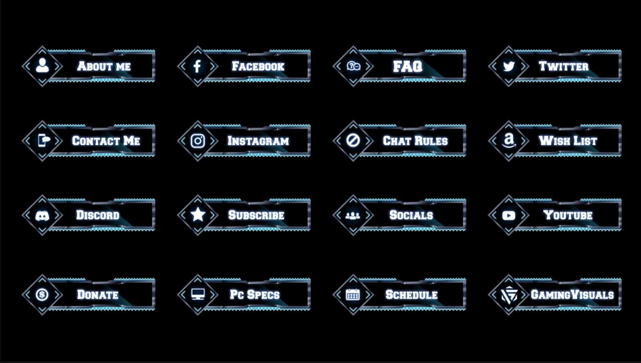
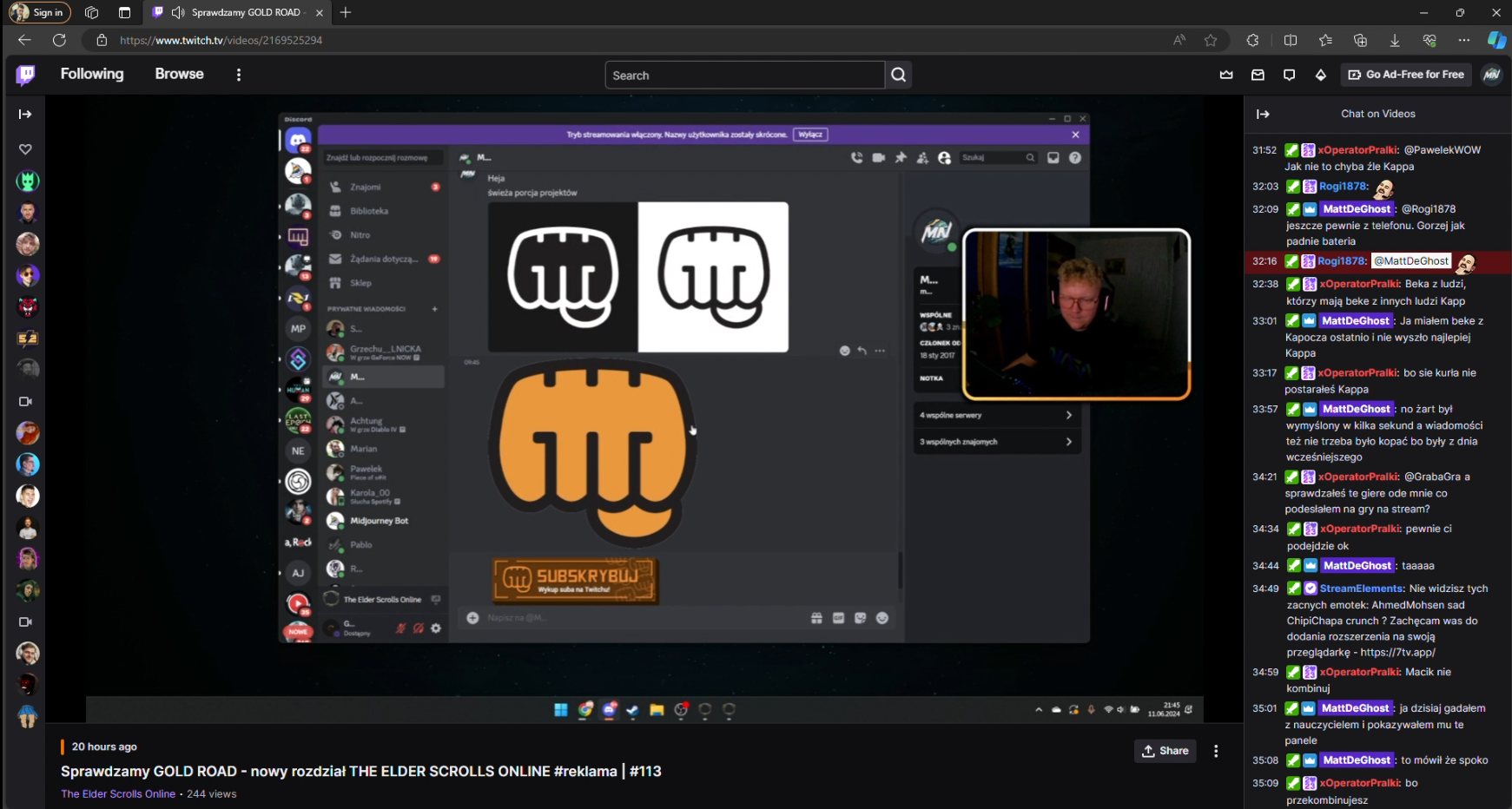
In order to get the best feedback, I wanted to involve both the client and his community into the designing process. I was able to perform such a method during the livestreams where my client showcased my work and then I could observe the community reaction and get involved into the discussion as well. This method was used several times along the way, for various visual elements such as logo design or information panels.
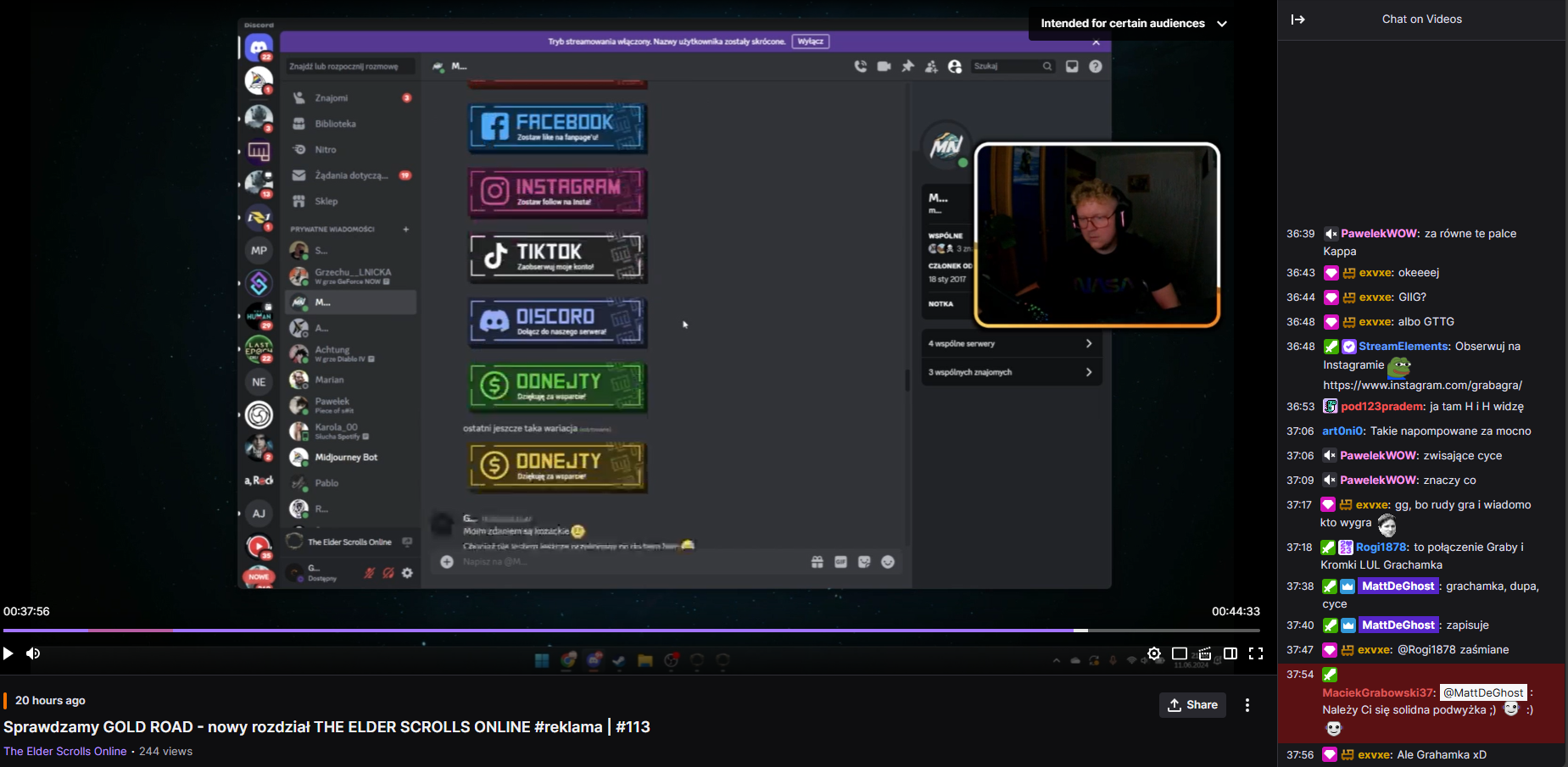
The visuals can be created and finalized thanks to the valuable feedback but since some of my elements had to be compatible with the streaming software and its settings I had to perform a user test. I sent the files over to my client and asked him to set them as his default streaming layout. He did as I asked, which provided me with the information about the mistakes I made in the design. For instance, wrong dimentions of the activity feed widgets that could not fit the text in a way it is readable.

To get some inspiration for the portfolio I browsed through the Awwwards website and triend to find a website design that can fulfill my reauirements. The website showcase that I found had some very interesting elements that I wanted to implement in my online portfolio. Those elements included the preload page, curtain menu and the dynamicaly moving title text.